Illustration
|
|
Growth and Decay
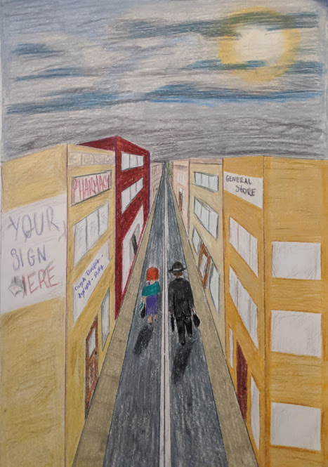
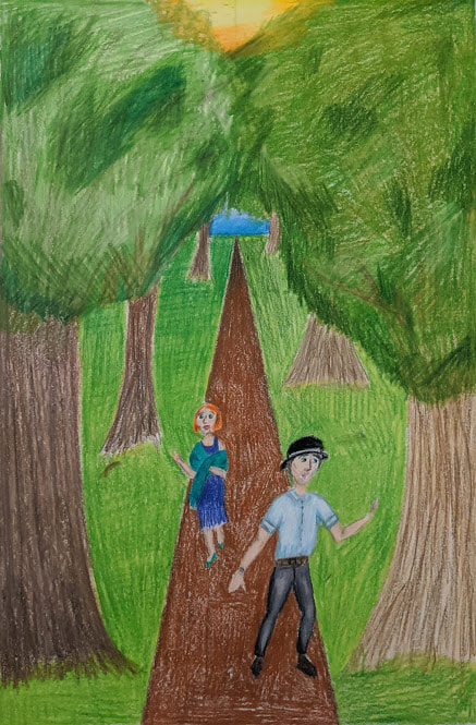
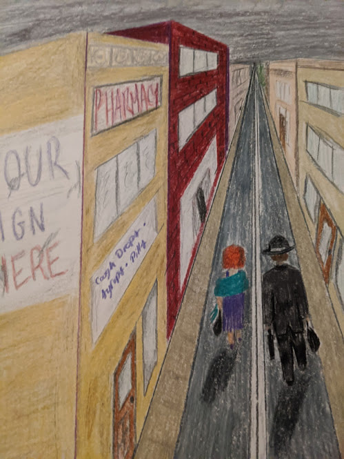
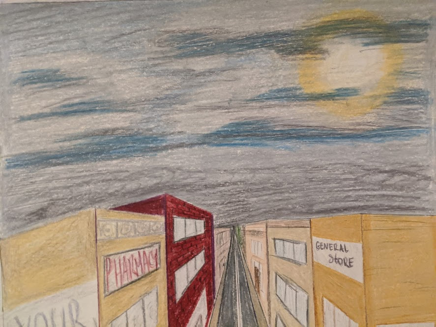
Illustration 25.4cm x 38.1cm December 2019 Exhibition Text “Growth and Decay” was inspired by vintage travel posters and places from my childhood. The decay of my hometown and the growth of the beautiful forests I’ve spent a lot of time in. There’s beauty in both the age and the destruction of the old towns, and the new life in the lavish forests. Both inspire wonder and discovery, like the travel posters. |
Planning
Inspiration
For this project I was inspired by vintage travel posters. I liked the style of some of the posters and liked the simplicity of them. I wanted to take the happy idealized perspective that you see in the posters and implement that into my designs. I wanted my second illustrated to be more of the travel poster-like wonder and beauty that would draw people in to visit. Which is what I wanted to show happening with the tired couple. My first image was to be the opposite, a dreary little town that is broken and falling apart. I wanted to have that same inspiration that you get from seeing the posters reflect in my work.
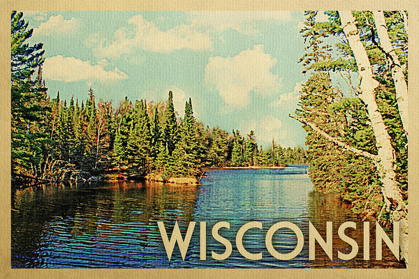
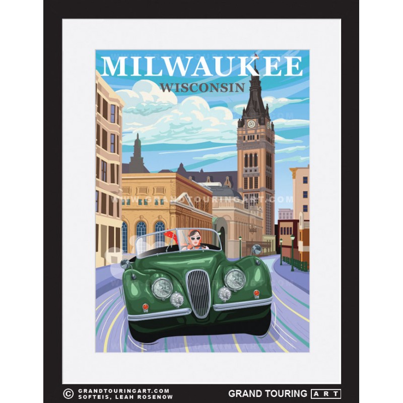
I love the clean bright style seen in the travel posters. I wanted that specifically in my work, especially in the ‘new’ image. I really looked at posters from Wisconsin, since that’s where my pieces are rooted. My first is rooted in Fox Lake, WI, a little small bar town at the top of Dodge County. I’ve spent about half of my life there and it’s one of my biggest inspirations. The town is getting worn down, people are leaving and not many are coming, it’s sad to see it decaying, but there is a beauty in that decay. My ‘new’ forest is inspired by the many hiking adventures I’ve been on. Some of my favorite places, like Devil’s Lake or Harrington Beach, have huge wondrous trees and greenery. Those places are some of the most comforting and homey places I’ve ever been. I really used Harrington Beach in my second image, the lively green and the wonder you see in the couples eyes are exactly how I feel when I’m there. Both the forest and Fox Lake are very present in my images, along with the travel posters. Altogether they helped make my pieces and helped me realize the true beauty in decay and growth.
(Click to enlarge and for citation)
For this project I was inspired by vintage travel posters. I liked the style of some of the posters and liked the simplicity of them. I wanted to take the happy idealized perspective that you see in the posters and implement that into my designs. I wanted my second illustrated to be more of the travel poster-like wonder and beauty that would draw people in to visit. Which is what I wanted to show happening with the tired couple. My first image was to be the opposite, a dreary little town that is broken and falling apart. I wanted to have that same inspiration that you get from seeing the posters reflect in my work.
I love the clean bright style seen in the travel posters. I wanted that specifically in my work, especially in the ‘new’ image. I really looked at posters from Wisconsin, since that’s where my pieces are rooted. My first is rooted in Fox Lake, WI, a little small bar town at the top of Dodge County. I’ve spent about half of my life there and it’s one of my biggest inspirations. The town is getting worn down, people are leaving and not many are coming, it’s sad to see it decaying, but there is a beauty in that decay. My ‘new’ forest is inspired by the many hiking adventures I’ve been on. Some of my favorite places, like Devil’s Lake or Harrington Beach, have huge wondrous trees and greenery. Those places are some of the most comforting and homey places I’ve ever been. I really used Harrington Beach in my second image, the lively green and the wonder you see in the couples eyes are exactly how I feel when I’m there. Both the forest and Fox Lake are very present in my images, along with the travel posters. Altogether they helped make my pieces and helped me realize the true beauty in decay and growth.
(Click to enlarge and for citation)
Sketches
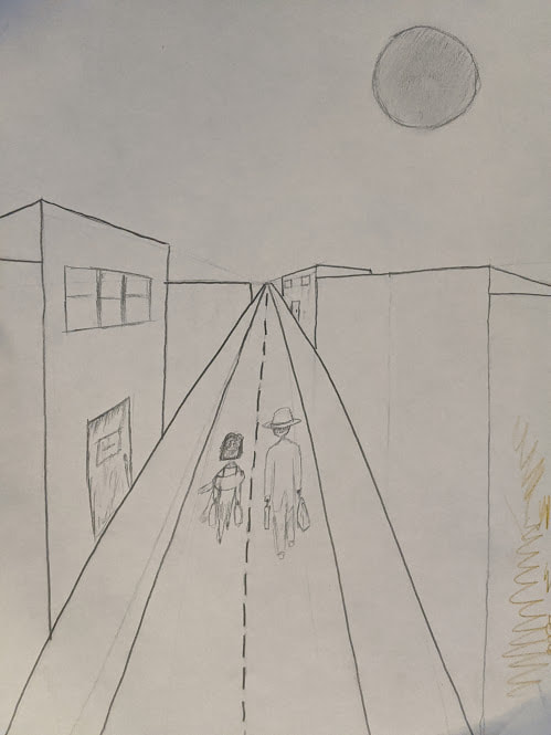
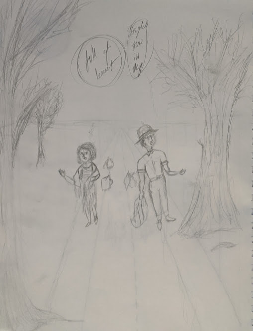
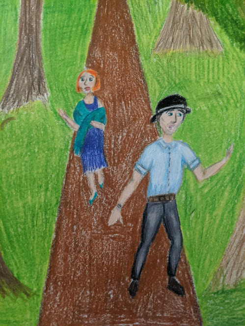
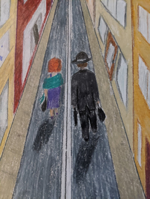
For this project I wasn't sure what I wanted to do initially, I wasn't sure what I wanted to focus on. I knew I wanted to have a 1920's couple somewhere in the piece but I didn't know what to do. Once I looked at the travel posters I knew exactly what I wanted, now the problem was putting that on paper. My sketch for my first piece, the old town, I modeled after my home town. The main street is lined with old buildings connected to each other creating a almost trapped feel. I wanted the couple to be walking away from the viewer, slumped over leaving the old town with their things. The second image, the lush forest, I wanted the couple to be full of joy and wonder, seeing a beautiful lively forest. I wanted the people to be walking off the path and discovering the newness and beauty.
Process
Experimentation
I really didn't do much inspiration on my own, I really had a specific idea for this project. The main thing I debated was whether to use a small town like Fox Lake, or a bigger city like Milwaukee. I ultimately used a small town because it demonstrated decay much better than an ever-changing and expanding city would.
Process/Steps
- The first thing I did was make the sketches. I layed out the basic idea of what I wanted and made a couple notes of what I specifically wanted.
- Next I measured out the dimensions of what I needed, 10x15, and I layed out my lines for perspective. I started with the horizon line, which is a third of the way down the page, and then I made the lines for my road and path. For the decay image I continued to make lines for the sidewalks, windows, doors, and tops of the buildings. For my growth image I didn't have to make any other straight guidelines, so I started to make the basic outlines of the trees with a brown colored pencil to make sure I had enough space and to figure out how many trees would be seen.
- The next thing I did was to sketch the basic shaped of the couple lightly so I had an idea of where I wanted them to be exactly.
(click to enlarge).

- After I had all of my basic shapes and lines I started to color my pieces. I worked on my decay image first.
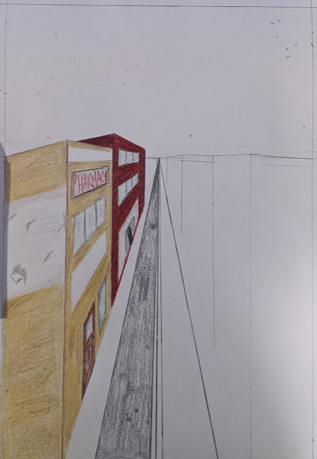
- I started by coloring in the buildings with neutral tna and yellow tones to get the basic color of the buildings. I did make one building a deep red brick color to have a bit of other contrast.
- Once I had my basic colors for the buildings I added a bit more detail. I added darker lines to create a brick look to most of the buildings. After that I worked on the windows and doors. I made the little shade lines and added a little depth to them. Once I had that I worked on the areas I left open for the old signs on the buildings. I tried to make them look old and worn as they would on a real building, the paint coming off, smudging, etc.
- Now that I had the building I worked on the people, I started on their clothing, since is was the only thing giving them shape. I tried to do 1920's style clothing, the woman in a simple, purple, shapeless flapper-like dress with a teal scarf. The man is in a simple black suit and hat. Both are seen with their bags walking away.
- Finally, for the first image, I colored in the road with black and grey, the sidewalk with tan and grey, then I worked on the sky. I made the sun peaking out of the clouds as a sign of hope, I covered the rest of the sky with shades of greys and blues, and a bit of purple.
- Now for the growth image, I simply started by making my trees, and covering the sky. I made the bark of the trees with browns and a bit of black. I then made the sun by shading in an area of the sky with yellow then orange and red radiating from the yellow. I then covered the rest of the sky with green to have the overhang of the trees. I then added depth to the trees by mixing in darker tones or green and a bit of brown.
- I then worked on the grass by covering it in a lighter green and adding darker areas in the farther areas of the landscape. I worked on the couple and then colored in the dirt path with a lighter brown and added uneven darker patches throughout the path.
- For the people I started with the faces and showing skin. I colored in with a peach color and added pink patches to the cheeks. I drew their facial features like their eyes, brows, nose, and mouth, and the woman's hair. I then worked on the clothes.
- The woman was mostly covered with the green scarf, so I colored that, added darker folded areas and colored in the dress accordingly. For the man I colored in his shirt with white, grey and teal to add color to his wardrobe. His hat was added, their shoes were drawn and both pieces were complete.
Reflection
I think my pieces are similar to the travel posters I looked at. I think it mainly the 'growth' image shows it the most, the bright wondrous image that makes you want to get out and do something and go somewhere new. The first possibly shows what we are all unknowingly trapped in, a dark boring life that is aging and falling apart without us realizing. I think my ideas for this project were really good, and I think they reflect in my work. I think I could have potentially done better with the quality of the work. To do that I would have to practice a lot more with using colored pencils, I normally uses regular led pencils for my personal work, which is closer in style to this project. The main thing is that my ideas shine through and is able to be seen by the viewer.
ACT Responses
Clearly explain how you are able to identify the cause-effect relationships between your inspiration and its effect upon your artwork:
The posters I used for inspiration really shines through on the 'growth' illustration, and I show the opposite in my first piece. I used the bright colors and idealized landscapes seen in the travel posters.
What is the overall approach (pov) the author (from research) has regarding the topic of your inspiration?
The artists who make the posters are paid to make them by the travel agencies and towns to pull people in. These posters are just advertisements for these towns.
What kind of generalizations and conclusions have you discovered about people, ideas, cultures, etc. while you researched your inspiration?
I realized that these places are depicted better than they actually are. They enhance the beauty and innovations that might make people want to visit. The posters are meant to trick the viewer, the people and the companies who made these are like corporations advertising their goods to draw people in.
What was the central idea or theme around your inspirational research?
I wanted to show the beauty in growth and decay. I wanted to show that even old rundown places and things have just as much beauty as something new and lively.
What kind of inferences did you make while reading your research?
I figured that the places were stylized images from the travel destinations. The posters are to pull people in and make them want to visit the place, the illustrations had to have bright colors and smooth edges, to subconsciously make the viewer think this place is a magical perfect place.
Bibliography
- “Roadside America Wisconsin Travel Poster of Milwaukee.” Grand Touring Art - Automotive Travel Posters for Sale, https://grandtouringart.com/travel-posters-for-sale-of-roadside-america/68-276-wisconsin-poster-milwaukee-wi-milwaukee-city-hall.html.
- Sztukowski, Irina, et al. “Wisconsin Travel Poster - Vintage Travel Poster by Flo Karp.” Fine Art America, 3 Dec. 2019, https://fineartamerica.com/featured/wisconsin-travel-poster-vintage-travel-flo-karp.html?product=poster.
- Sztukowski, Irina, et al. “Wisconsin Travel Poster - Vintage Travel Poster by Flo Karp.” Fine Art America, 3 Dec. 2019, https://fineartamerica.com/featured/wisconsin-travel-poster-vintage-travel-flo-karp.html?product=poster.
