Illustration
|
|
Growth and Decay
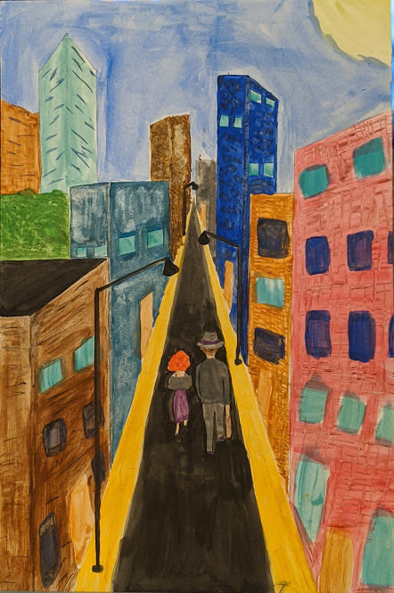
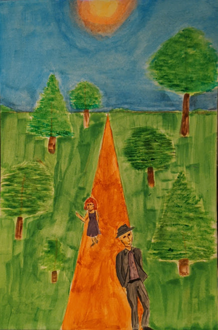
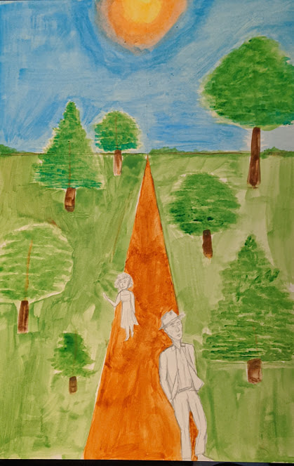
Illustration Board + Gouache 25.4cm x 38.1cm January 2020 Exhibition Text “Growth and Decay” was inspired by vintage travel posters and places from my childhood. The decay of my hometown and the growth of the beautiful forests I’ve spent a lot of time in. There’s beauty in both the age and the destruction of the old towns, and the new life in the lavish forests. Both inspire wonder and discovery, like the travel posters. |
Planning
Inspiration
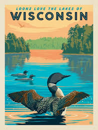
For this project I was inspired by vintage travel posters, and some of the places where I have grown up. I liked the style and simplicity of the posters and the ideas they convey. I wanted to take the happy idealized perspective that you see in the posters and implement that into my designs. I wanted my second illustration, the wooded forest, to be more of the travel poster-like. I wanted it to show the wonder and beauty that draws people in to visit. Which is what I wanted to show happening with the tired, weary couple. My first image is the opposite, a dreary little town that is broken and falling apart, somewhere they just wanted to leave. I wanted to have that same inspiration that you get from seeing the posters reflect in my work. I wanted that feeling many people get, especially teen, that feeling of just wanting to leave their hometown and explore the world.
I wanted that shown in my work, especially in the second, "growth" image. I really looked at posters from Wisconsin and the midwest. My first is based on my hometown Fox Lake, WI, a little small bar town at the top of Dodge County. I’ve spent about half of my life there and it’s one of my biggest inspirations. The town is getting worn down, people are leaving, or dying, and not many are coming. It’s very sad to see it getting worn down and decaying, but there is a beauty in that decay. My lush forest is inspired by the many hiking trails I go to with my family during the summer. Some of my favorite places, like Devil’s Lake or Harrington Beach, have huge trees and greenery that I wish I could just live in. Those places are some of the most comforting and homey places I’ve ever been. I really used Harrington Beach in my second image, the lively green and the wonder you see in the couples eyes are exactly how I feel when I’m there. Both the forest and Fox Lake are very present in my images, along with the travel posters. Altogether they helped make my pieces and helped me realize the true beauty in decay and growth.
(Click to enlarge and for citation)

Sketches
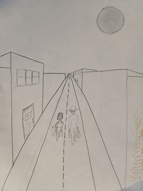
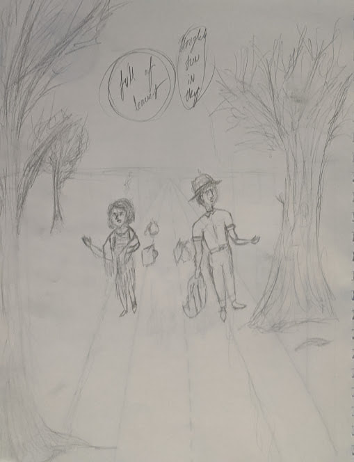
I really wasn't too sure what I initially wanted to do for this project. I had randomly thought of old travel posters and thought that would be a really good idea. I love the look of anything vintage and the style of the posters. Wanted to transfer that style into my work. My sketches were very basic, with the general outlines and shapes of what I wanted in my final project. Like I said in the previous page, I wanted the first image to be modeled after my home town, and I wanted the second image to be a lush forest like some of my favorite hiking areas. I wanted the mood of the couple to obviously change between the two images.
Process
Experimentation
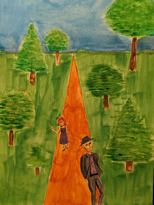
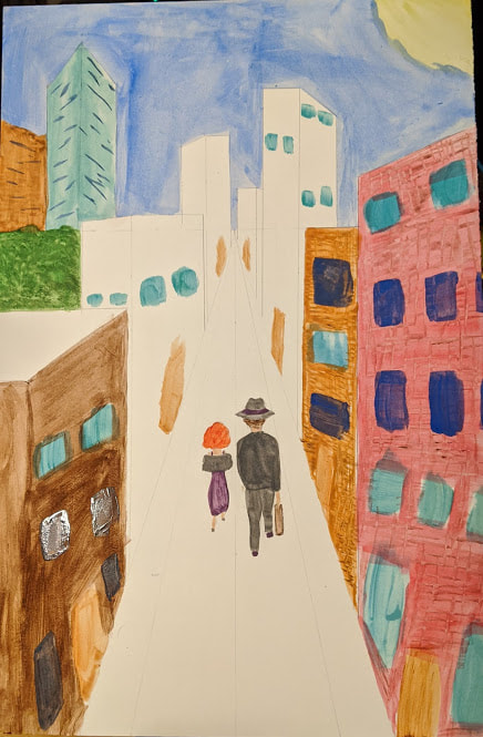
After doing my initial critique of my colored pencil drawings of these, there were some things I had to change, adn wanted to change anyways. In the first image I made the heights and colors of the building varying, and taller to make them seem more trapped and enclosed in the city. I also added broken street lamps and messy building textures. For the second image I made smaller and more spaced out trees to show their new freedom.
Process/Steps
- For painting these pictures, with gouache, I had to experiment with the paint, since I had never used it before. I don't know if I would use gouache again if I could choose, but I'd be comfortable using it more.
- Next I drew out the basis of the images. I drew the horizon lines, the paths, the couple and the other buildings and trees.
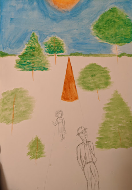
- I decided to start with the second image, I painted the beginning of the path with a light brown shade. (A mix of Yellow Ochre and Burnt Sienna)
- Then I moved on and painted the sky, I used a light blue all over, (Coeruleum and white). In the center of the sky I painted the sun, which was just a gradient of white to yellow to orange, (White, Lemon Yellow, Vermillion, and Crimson).
- After the sky was done I moved on and worked on the trees. I used the light brown of the path to lay out lines for the trees. I then took different shades of green to make the shapes and layers of the trees, (Sap Green, and Viridian). I then used my dark brown to make the bark of the trees, (Burnt Umber).
- With the trees, sky and most of the path done, I decided to paint the couple. I used a lot of different colors and shades. I mostly used grey and purple for the couple, mainly in their clothes.
- Now I painted the grass, which I just took green and painted over all of the white areas, (Sap Green).
(click to enlarge).
After doing my initial critique of my colored pencil drawings of these, there were some things I had to change, adn wanted to change anyways. In the first image I made the heights and colors of the building varying, and taller to make them seem more trapped and enclosed in the city. I also added broken street lamps and messy building textures. For the second image I made smaller and more spaced out trees to show their new freedom.
Process/Steps
- For painting these pictures, with gouache, I had to experiment with the paint, since I had never used it before. I don't know if I would use gouache again if I could choose, but I'd be comfortable using it more.
- Next I drew out the basis of the images. I drew the horizon lines, the paths, the couple and the other buildings and trees.
- I decided to start with the second image, I painted the beginning of the path with a light brown shade. (A mix of Yellow Ochre and Burnt Sienna)
- Then I moved on and painted the sky, I used a light blue all over, (Coeruleum and white). In the center of the sky I painted the sun, which was just a gradient of white to yellow to orange, (White, Lemon Yellow, Vermillion, and Crimson).
- After the sky was done I moved on and worked on the trees. I used the light brown of the path to lay out lines for the trees. I then took different shades of green to make the shapes and layers of the trees, (Sap Green, and Viridian). I then used my dark brown to make the bark of the trees, (Burnt Umber).
- With the trees, sky and most of the path done, I decided to paint the couple. I used a lot of different colors and shades. I mostly used grey and purple for the couple, mainly in their clothes.
- Now I painted the grass, which I just took green and painted over all of the white areas, (Sap Green).
(click to enlarge).
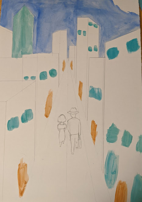

- With the second image done, it was time to work on the first image. I started with the windows and doors. As you can see in the images, I took light blue and brown and painted it in the general area of where I wanted them.
- After that I began to paint some of the buildings, I started with the more forward buildings, Like the red one and the brown ones.
- I took a break from the buildings and painted the backs of the couple. I used the same greys and purples as I did in the second image, the only difference with them was that the woman had a shawl and the man had a suitcase.
- Now that the couple was painted, along with some of the buildings, I decided to paint the street, sidewalk, and lamp posts. I used black and brown for all of this, (Black and Yellow Ochre). The street and lamp posts were all black, and the sidewalk was the light brown.
- After the couple, the street and street lamps, and some of the buildings were painted, I decided to paint the rest of the buildings. I used different colors, some bright, but mostly dark. I painted some more, darker windows as well, For the buildings farther back I just painted the windows as lines.
- I then painted the sky. I used my slightly darker blue and yellow and white for the sky, (Ultramarine, Lemon Yellow, and White). I painted the blue all over the sky and left an area open in the top right corner for the moon, which I mixed the white and yellow.
- With everything else painted I added some last details, like texture to the buildings and shading and other last minute details.
Compare and Contrast
Compare
- My pieces are definitely
Contrast
- My inspiration pieces are obviously much cleaner and more stylized than my final project. It was my first time using gouache so I knew it wouldn't look as good as the digital-like professional posters. I'm also not much of a illustrator, so I really had to try and figure out what I wanted it to look like.
Reflection
I think my paintings were similar to travel posters, but still different. Mine were not as clean as the posters, which I normally dom't make things as clean as they could be, which for some circumstances I like that better. I think I could have added more detail to the paintings and could have done better in certain aspects, like the lines and details, and the skies especially. I am happy with how they turned out nonetheless, and think this project was very fun.
ACT Responses
Clearly explain how you are able to identify the cause-effect relationships between your inspiration and its effect upon your artwork:
The posters I used for inspiration really shines through on the 'growth' illustration, and I show the opposite in my first piece. I used the bright colors and idealized landscapes seen in the travel posters.
What is the overall approach (pov) the author (from research) has regarding the topic of your inspiration?
The artists who make the posters are paid to make them by the travel agencies and towns to pull people in. These posters are just advertisements for these towns.
What kind of generalizations and conclusions have you discovered about people, ideas, cultures, etc. while you researched your inspiration?
I realized that these places are depicted better than they actually are. They enhance the beauty and innovations that might make people want to visit. The posters are meant to trick the viewer, the people and the companies who made these are like corporations advertising their goods to draw people in.
What was the central idea or theme around your inspirational research?
I wanted to show the beauty in growth and decay. I wanted to show that even old rundown places and things have just as much beauty as something new and lively.
What kind of inferences did you make while reading your research?
I figured that the places were stylized images from the travel destinations. The posters are to pull people in and make them want to visit the place, the illustrations had to have bright colors and smooth edges, to subconsciously make the viewer think this place is a magical perfect place.
Bibliography
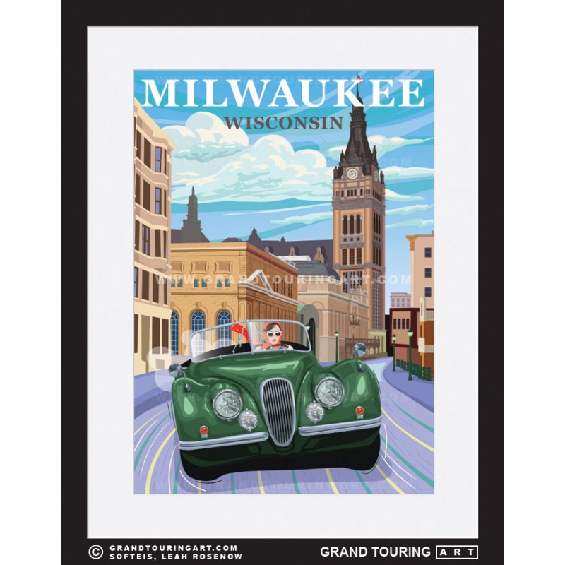
- “Roadside America Wisconsin Travel Poster of Milwaukee.” Grand Touring Art - Automotive Travel Posters for Sale, https://grandtouringart.com/travel-posters-for-sale-of-roadside-america/68-276-wisconsin-poster-milwaukee-wi-milwaukee-city-hall.html.
- Sztukowski, Irina, et al. “Wisconsin Travel Poster - Vintage Travel Poster by Flo Karp.” Fine Art America, 3 Dec. 2019, https://fineartamerica.com/featured/wisconsin-travel-poster-vintage-travel-flo-karp.html?product=poster.
- Sztukowski, Irina, et al. “Wisconsin Travel Poster - Vintage Travel Poster by Flo Karp.” Fine Art America, 3 Dec. 2019, https://fineartamerica.com/featured/wisconsin-travel-poster-vintage-travel-flo-karp.html?product=poster.
